The Great Grethryn Color Project
I recently completed a very fun project that I'd been wishing to do since I wrote this post way back in February of 2013.

Almost as soon as the original Grethryn Hat (OG--ha!) was published, I wanted to put some color into her. Don't misunderstand--I love this original one with two natural colors of Ravenwood Cashmere 3-ply. It's so sweet!

But there's nothing at all wrong with adding some color! However, you must proceed with caution when choosing colors for Fair Isle stitch patterns. Choose for compatibility, but also for contrast. Placing two colors next to one another that do not have enough contrast only serves to hide the lovely stitch pattern you're working so hard to give attention to. Let's look at how I not only made that mistake but also learned to choose better.

First, let's identify the basic stitch pattern for the Grethryn. It consists of three different Fair Isle motifs--two peerie patterns and one larger border pattern. I wanted this project to be good for beginner Fair Isle knitters, so it begins with just alternating between the main color and a contrasting color for one round (A). Then a couple more main color rounds are worked before trying three rounds of alternating the same for a checkerboard effect (B). Then you relax with two more rounds of main color before it gets a bit more challenging as you work a larger seven-round OXO pattern (C). Then the B pattern and then the A pattern are each repeated for symmetry.

The first color Grethryn that I made, on the left, taught me a lot about color choice. You can see that my A color choice of light grey had good contrast against the dark blue background, but most of the colors between the two A patterns are mushy. There wasn't enough difference between the shades of the different hues that I chose--they were too similar in value. I chose better with my second attempt on the right. See how the stitch pattern is honored and apparent?
These two hats are my husband's and mine and we wear them a bunch. That attests to the quality of this yarn, which is Rowan Felted Tweed DK. I used this yarn to knit these and all the following hats. These two were knit all on size 4 (3.5 mm) 16" circular needle with a k2/p3 rib as in my written pattern, but all the rest were started at the rib on a size 2 (3 mm) 16" circular needle with k3/p2 rib and worked with size 4 needle on the remainder of the hat, which worked much better. This yarn relaxes after washing and wearing, so the adjustment to the rib helped keep it a little more snug.

These next two color Grethryns are similar in style, so I paired them for a pic. The only difference is color choice and the decision to "frame" the B-C-B area with rust on the hat on the left. I had fun adding little rounds of contrast color between the A, B, or C sections with differing results. Sometimes it's subtle, and sometimes it really helps define the area. I felt that these two had good contrast in the color choices, with the one on the left working the best in that regard. The teal and the light green used in the C section of the hat on the right almost do not lend enough contrast, but it works well enough. I am partial to greens and blues, which led me to these color choices. It might have gone better had I added in some gold or purple.

I had a little fun when I was working on the light green one above and asked my Instagram community for help when I was charting and deciding on which way to go with it. They were so sweet and gave me lots of feedback! As I said, I had made it harder by sticking to so small a color palette, so I needed help!
With some of these hats, I charted four different ways to position the colors before casting on. Even that did not assure success, however, because colored pencils on paper are never exactly like the knitted result, even when you are careful choosing your colors in pencil! That's one thing I like about it--it's an adventure!

With my next attempt I must have been distracted or getting complacent about the whole thing, because I ignored my own instructions and knit 12 rounds of main color instead of two before working the Fair Isle section. That's exactly backward--the 12 main-color rounds are supposed to come after the Fair Isle section and before the crown shaping. That pushed the color section way up near the crown shaping. Oh, well. I wasn't about to rip it out because of that. On this teal hat, I particularly liked the look of adding the dark purple into the middle of the B sections and the C section.

And I was really pleased with the contrast in this golden Grethryn.

But then I pulled back the challenge and tried a more simple approach. Each of the three sections, A, B, and C are only worked in one contrast color on the dark purple background. A is in gold, B is in teal, and C is in light green.
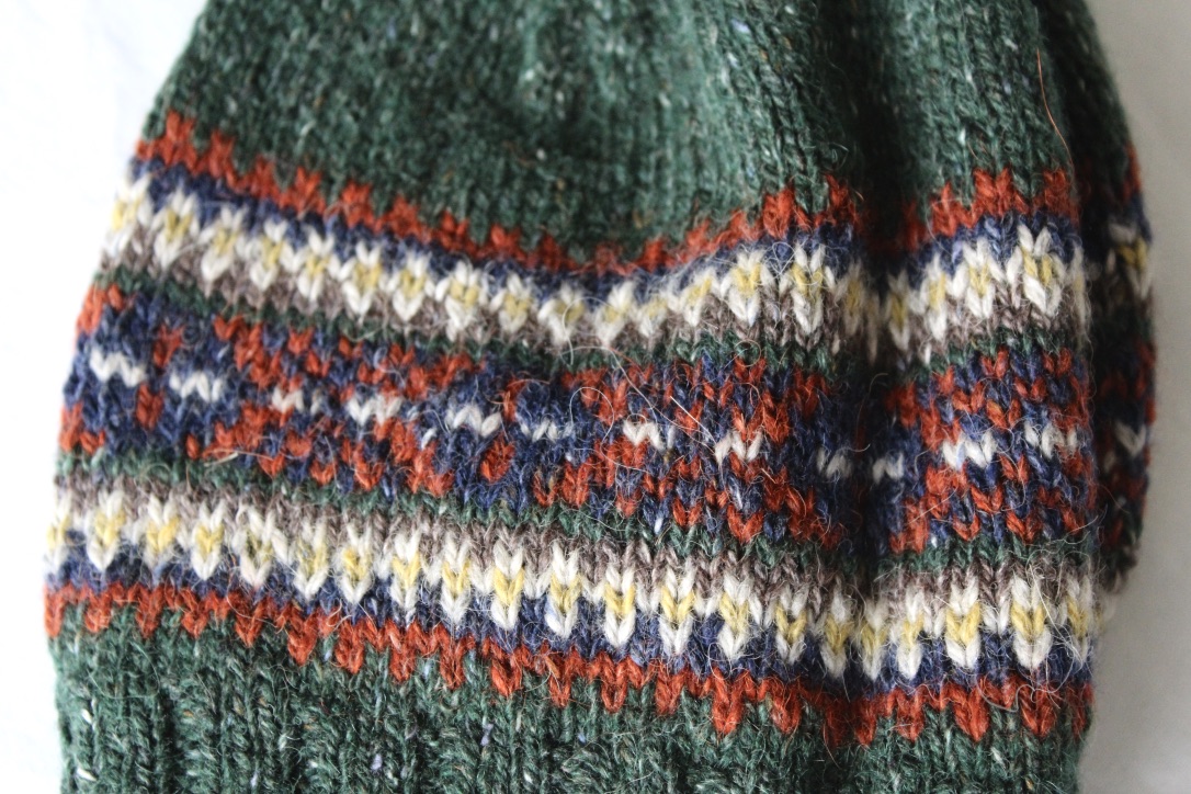
This dark green Grethryn was probably the most fiddly, because I changed colors more often. The A section simply morphs from the main color into rust, then the B section begins with dark blue, works its next part in light grey and gold, and then changes to taupe. The C section is bordered by the main color and then uses rust and dark blue with a touch of light grey in the center. I think the B sections look like little picket fences!
See how color choice and placement can make one simple Fair Isle pattern look so different? You wouldn't know that dark purple hat and that dark green hat were from the same pattern. So much fun.

Now we come to my favorite ones in the pack--the stripeys! The hat on the left was worked when I was growing short on yarn, which made me realize that the Fair Isle section did not need to be symmetrical. In other words, the first A and B sections did not have to match the second ones. I kept each section simple with just using two colors in each, and then I worked the crown in stripes. I used the yarn I had the most of for the stripes in the plain section before the crown decrease begun, and then the yarn I had the least of in the stripes when the stitches became fewer. It worked! I liked it so much that when I was done and realized I had enough yarn to make a whole nother hat, I just made the whole darned thing stripey. Sweet!

I was a little sad when this project was over. That's how much fun it was. If I'd had more colors of Rowan Felted Tweed, there's no telling how many hats I would have ended up with. As it stands, I have ten of these little beanies. I haven't decided what to do with them yet. I just like looking at the them. I think I'll hang 'em on the wall.
In case you're wondering, here are the colors of Rowan Felted Tweed that I used:
Cocoa (Taupe) #143
Pine (Dark Green) #158
Midnight (Dark Blue) #133
Ginger (Rust) #154
Clay (Light Grey) #177
Mineral (Gold) #181
Herb (Light Green) #146
Watery (Teal) #152
Bilberry (Dark Purple) #151
I used almost all of the nine skeins to make ten Grethryn Hats. When choosing colors for each hat, I usually narrowed these down to around five, remembering to use a good mix of dark and light colors, one neutral, and one pop color. I did not consult the color wheel when choosing compatible colors, but simply went with what I loved.
I hope I've inspired you to experiment with some Fair Isle yourself.
The Grethryn Hat is a fun way to do just that!
Happy Knitting!

Comments